Hearst Magazines: Custom Feeds Redesign
A modular building-block system and drag-and-drop editor that let editorial teams design curated layouts without engineering
- ~70%
- faster brand redesigns, from 6–8 weeks to 2
- ~50%
- of Hearst brands launched on Custom Feeds, as design lead
- 4
- designers led through end-to-end delivery
Problem
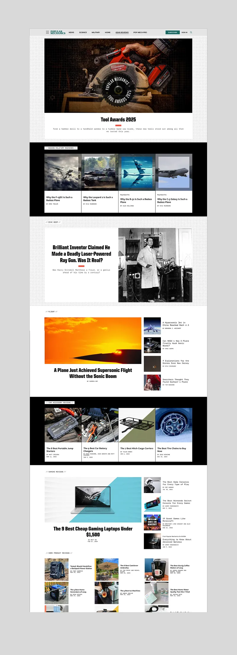
Our editorial staff was frustrated with their homepages and section landings. These pages were rigid, static layouts: a header area followed by a reverse-chronological stream of content. The magazines looked like blogs, not the respected brands they were. Editors had no way to curate, group, or differentiate their front pages without engineering support, and any layout change required engineering intervention.
Team
Theresa Mershon (Creative Director)
Artem Artemov (Product Design UI/UX Lead)
Ryan Ilano (Lead Designer / Front-End)
Namie Genkin (Senior Product Designer)
Tracey Dunham (Senior Product Designer)
RESPONSIBILITIES
Styling and Front End Development: SCSS/CSS committed to codebase
Design Systems + Product Design
Art Direction and Visual Approval
Visual QA on device (all layouts, all devices)
Achievement
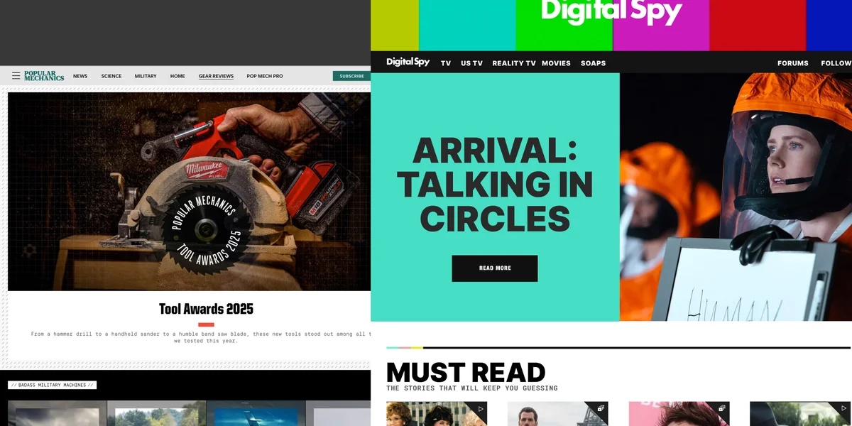
Reduced brand redesign turnaround from 6–8 weeks to 2 weeks, roughly 70% faster, by leading an accelerated launch process and improving the design system’s onboarding efficiency.
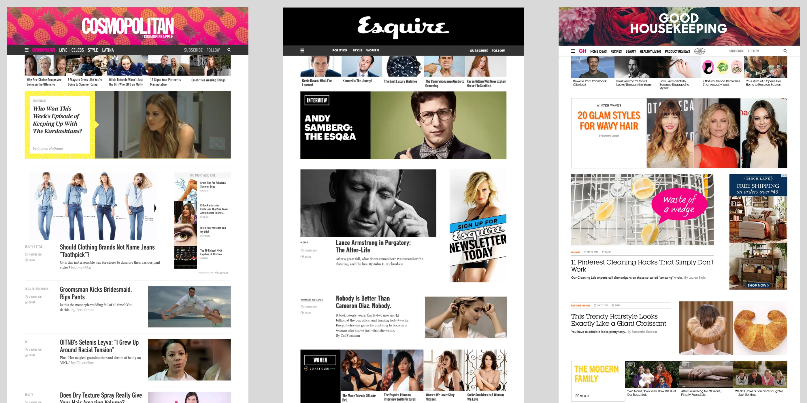
Before: a reverse-chronological stream
Content was published in a reverse chronological stream with no way to group or curate content. This made it difficult for editors to create engaging and visually appealing layouts that reflected their brand identity.
Approach
Custom Feeds was the answer: a system of modular building blocks and a graphical editor that gave editorial teams real control over their layouts without involving engineering. This was a tool designed for people who write for a living, not people who code — the complexity had to live entirely in the system, while editors accomplished sophisticated things through a drag-and-drop interface they could understand on day one.
I owned the art direction, visual design, and the production SCSS/CSS committed directly to the codebase — design and front-end delivery end-to-end, with no handoff or translation layer between design and shipped code. From H2 2019, as Design Lead, I drove an accelerated launch process to bring the remaining brands on at pace, managing a team of four designers through theming, front-end development, QA, and brand launches.
Building Blocks
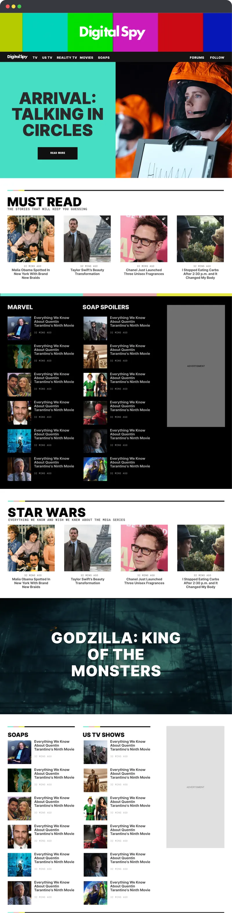
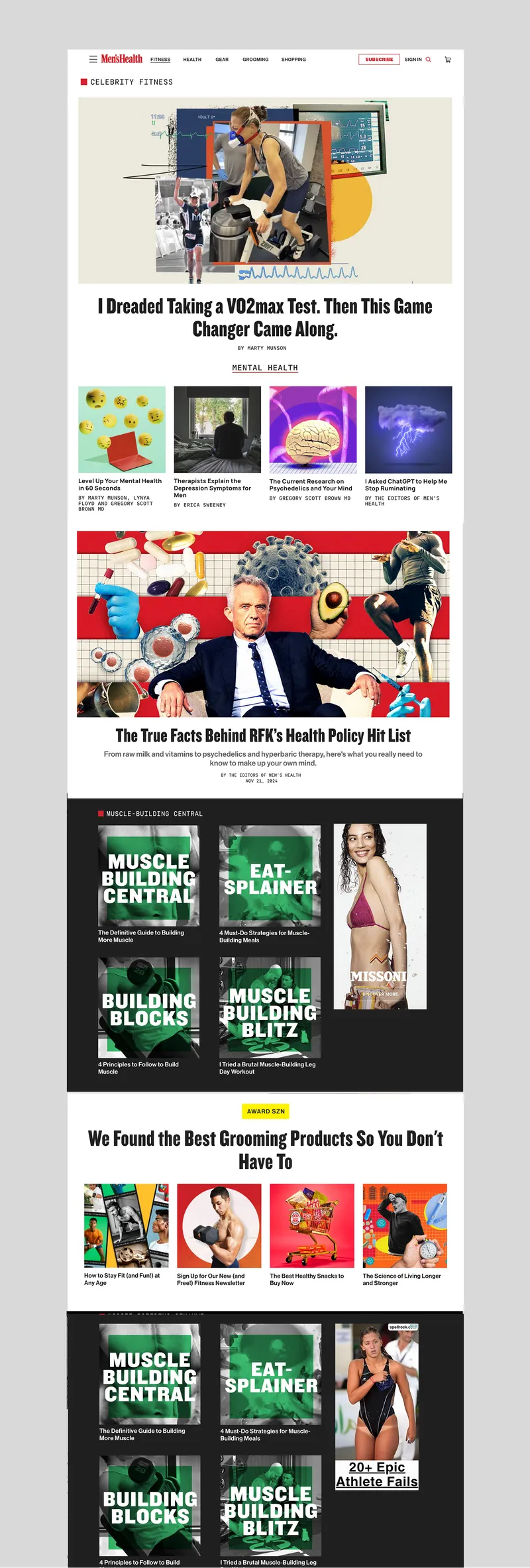
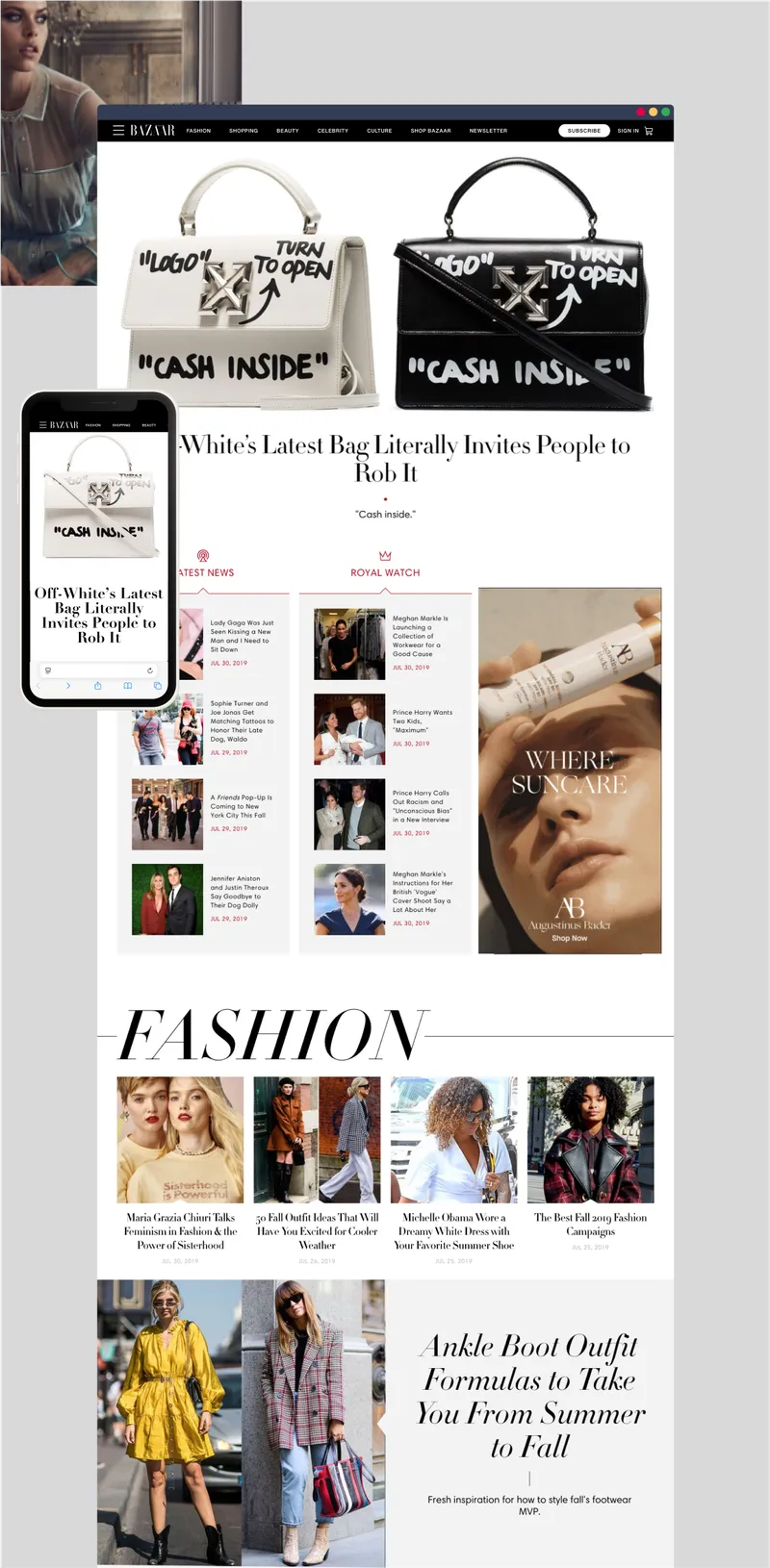
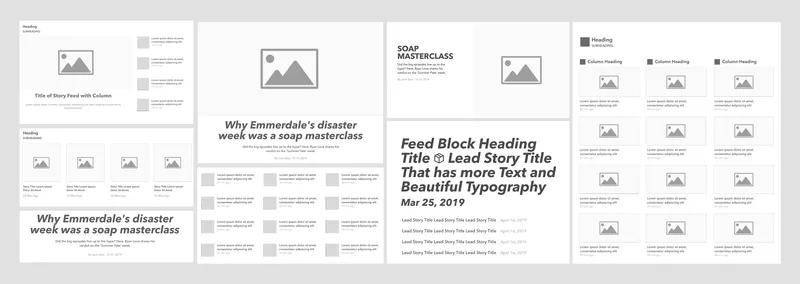
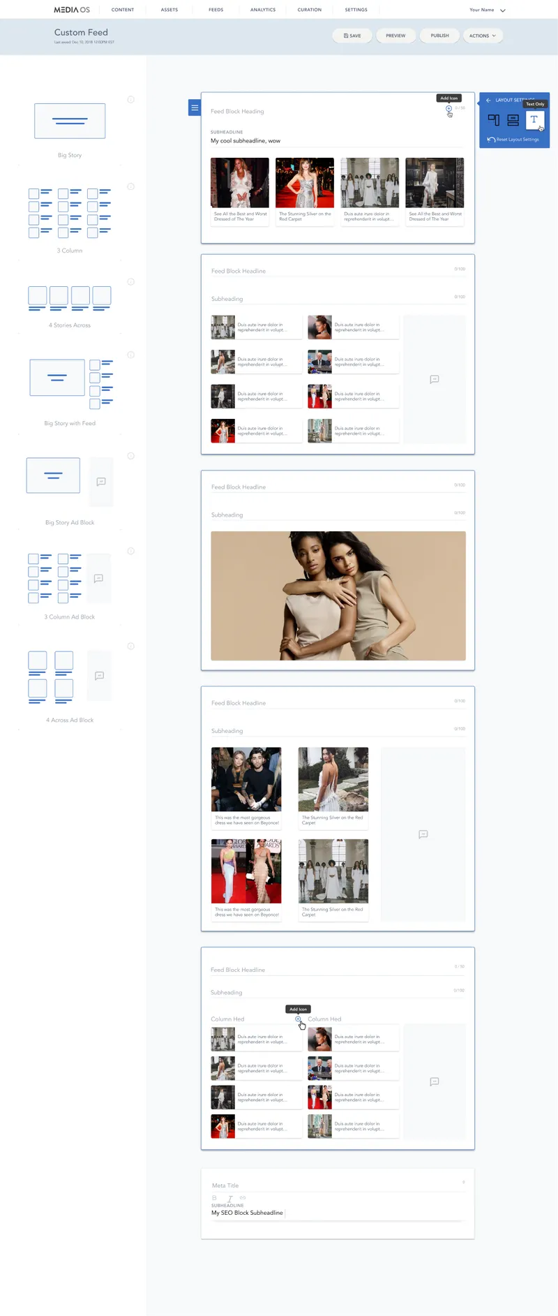
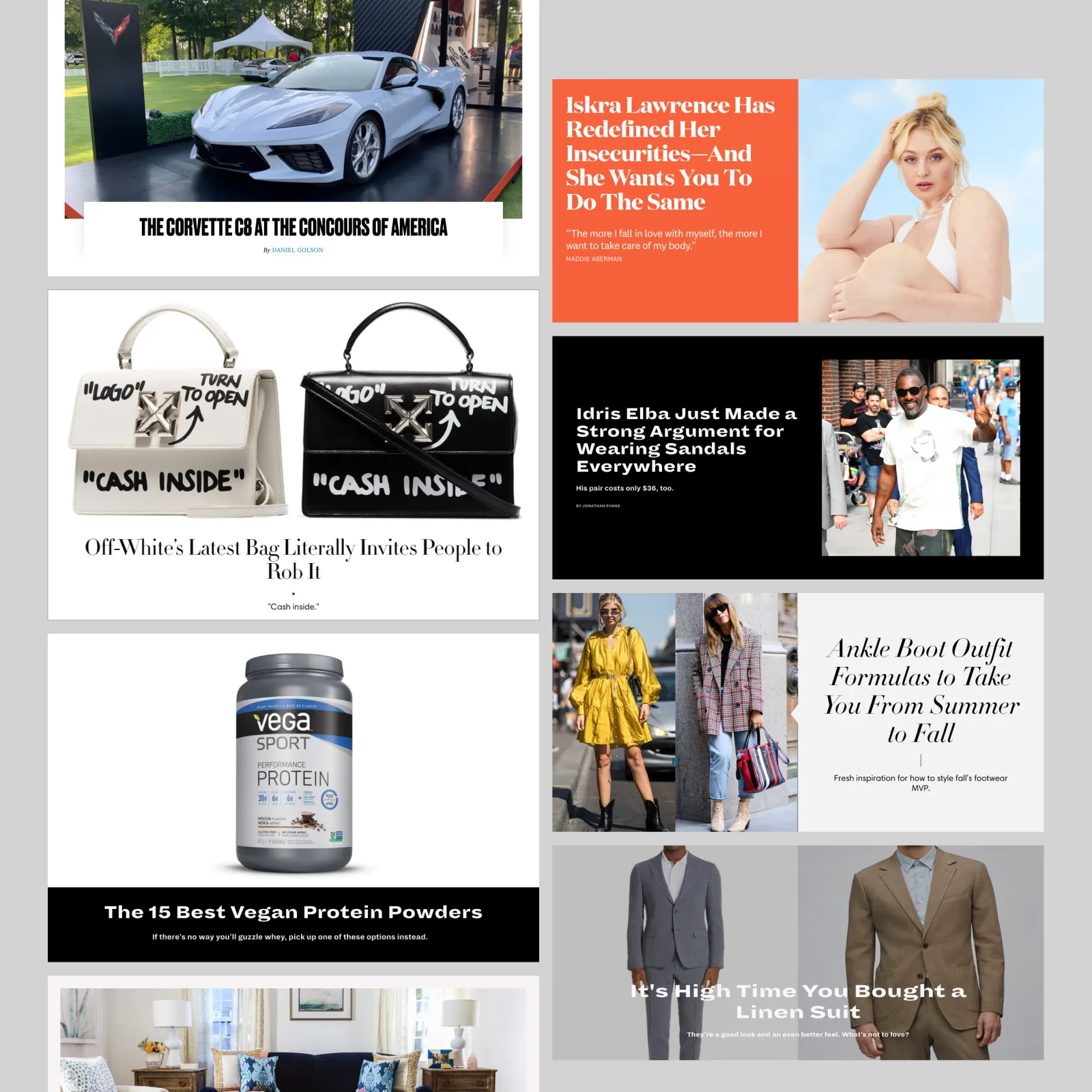
We designed a system of building blocks that could be used to create a wide variety of layouts and styles. These blocks included: Big Story, Big Story with Feed, 4-Across, and 3-Column. Each block had multiple styling options that could be applied to create unique looks for each magazine. The building blocks were designed to be flexible and adaptable, allowing editors to create custom layouts that fit their content and brand.
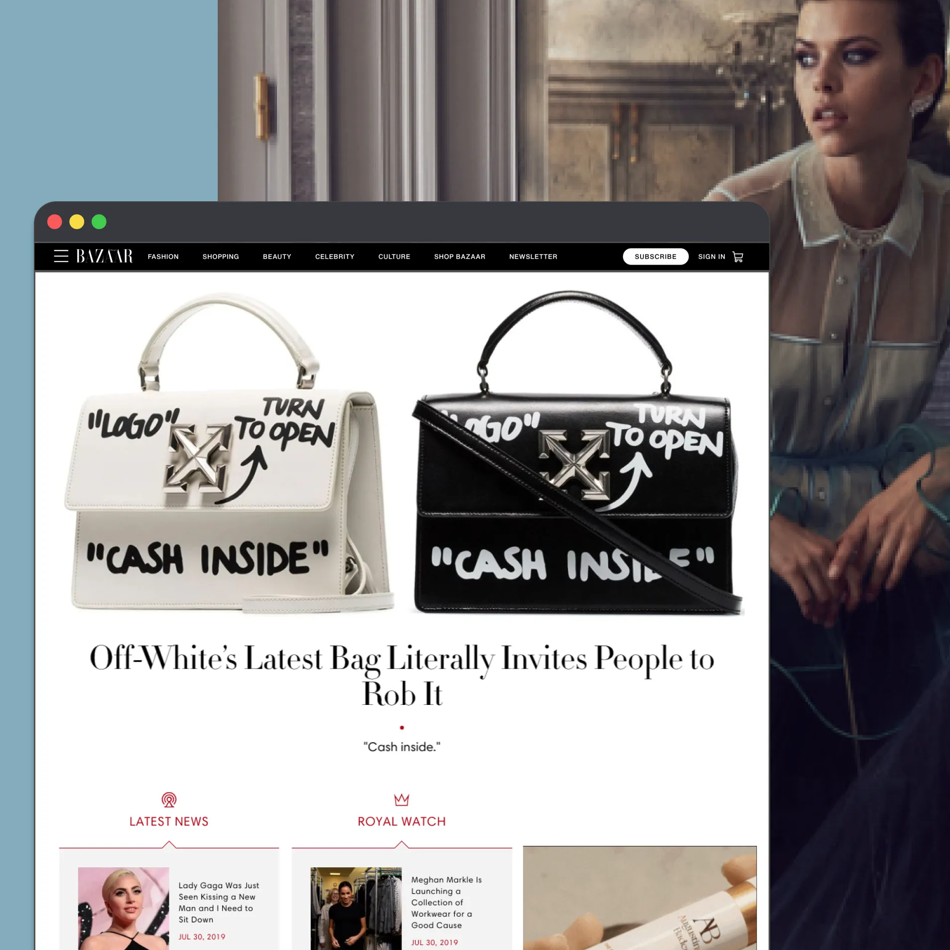
Each block had multiple styling options that could be applied to create unique looks for each magazine. The building blocks were optimized for performance and accessibility, ensuring that they would work well on all devices and screen sizes. They also had a consistent design language that reflected the overall aesthetic of the magazines, while still allowing for customization and creativity.
Advertisements could be integrated into the custom feeds, each block had layouts that would accomodate standard ad placements programatically. This allowed for a more engaging and less intrusive advertising experience for users, allowing advertisers to reach their target audience while still providing a seamless and enjoyable user experience.
Custom Feed Editor
The editors could create and manage their custom feeds through a graphical editor that allowed them to select and style the building blocks, curate content, and preview their layouts in real-time. The editor was designed to be intuitive and user-friendly, allowing editors to quickly create and publish their custom feeds without needing technical expertise.
Results
Outcomes
- Brand-redesign turnaround cut from 6–8 weeks to ~2 weeks (~70% faster).
- Brought ~50% of Hearst Digital Media’s sites onto Custom Feeds.
- Led 4 designers end-to-end across theming, front-end, QA, and brand launches.
- The block architecture, token approach, and component library established here carried forward into Apple News syndication, the Resin subscription platform, and the accessibility program.
Scope of Ownership
Art direction, visual design, and production SCSS/CSS committed directly to the codebase — design and front-end, no handoff. Owned design systems, art direction and visual approval, and on-device QA; as Design Lead, led a team of four designers through theming, front-end, QA, and brand launches.
Gallery